Doing the comparison
Here are a couple or example screens showing various comparison results and the text colouring.
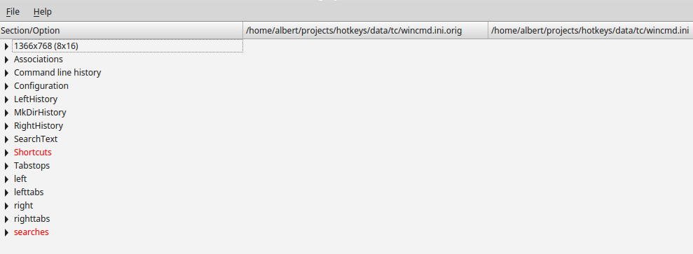
The first one is a comparison of ini files. Initially it only shows the section headers so it's easy to see which ones are useful to inspect further.

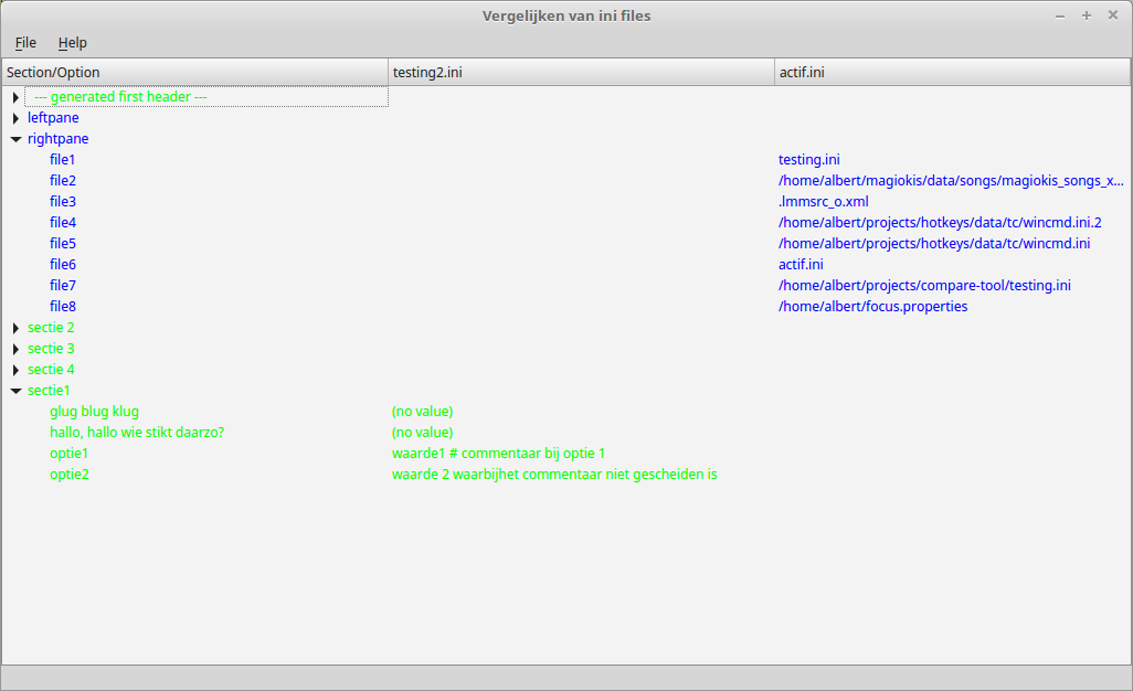
Below is another ini file comparison, showing expanded sections so the individual option values can be examined. Additionally, it is from a "loose" comparison in which for one of the files a missing first section header was generated to make the comparison possible.

Next up is the initial view of an XML comparison. The elements directly under the root are all visible:

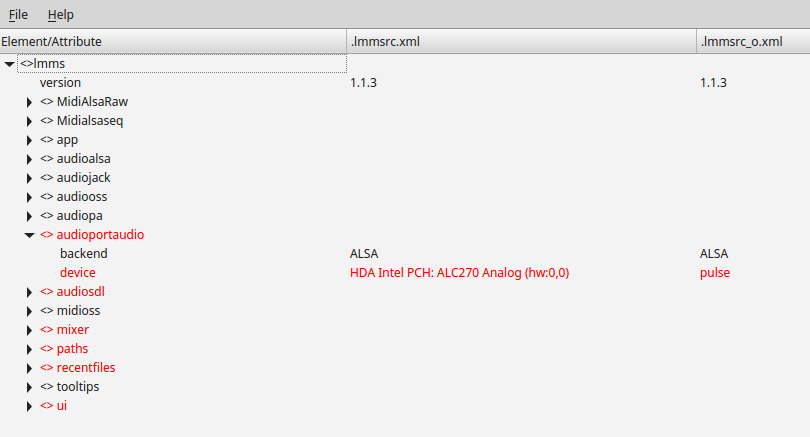
Another XML comparison, this time with an element that contains differences opened up:

Note how I've tried to differentiate between elements and attributes, by preceding the former with "<>" (like in my xmleditor).
This is also an XML comparison, with groups of similar elements as well as nested elements (on the right-hand side at least).

The latest comparison type is for plain text; it's not very interesting to show because it's just line by line, sorted alphabetically, without any (sub)levels. It's possible however that there's not text on one or the other side. It's even possible that there's no text on either side, but these entries are currently being suppressed.